Thyme Care
A mission-driven brief for a big-hearted business. We transformed a powerful idea into a trusted brand.
Compelled by a mission to help people better navigate the unknowns of a cancer diagnosis, Thyme Care approached us with a very clear brief: “create a brand that exemplifies our vision for a kinder care process.” As an oncology management solution for people at their most vulnerable, it was vital that the entire brand journey we co-created was accessible and approachable.
We wanted the patient to gain a sense of control in the process and knew this would start with a human-centric brand, in a category where humanistic design has traditionally taken a back seat. We knew we had to inject warmth and compassion, whilst creating a foundation that enables Thyme to remain relevant to major healthcare providers.
Thymecare.com
Disciplines
Brand Strategy
Brand Architecture
Competitive Analysis
Naming
Brand Design
Brand World
UI & UX design
Web Design
Brand Architecture
Competitive Analysis
Naming
Brand Design
Brand World
UI & UX design
Web Design
Team
Anthony Cappetta
Robert Medkeff
Sean Cooley
Robert Medkeff
Sean Cooley
Partners
A name infused with value.
We went beyond the obvious healthcare tropes to find something that spoke to the company's core values. In our research, we discovered that throughout history, the fragrant Thyme plant has been used to protect and support. It symbolizes deep friendship and devotion, a commitment to being there for the ones you love. The name, Thyme Care, represents their brand promise: “devotion, every day, to everyone affected by cancer.”
A brand with integrity at its heart.
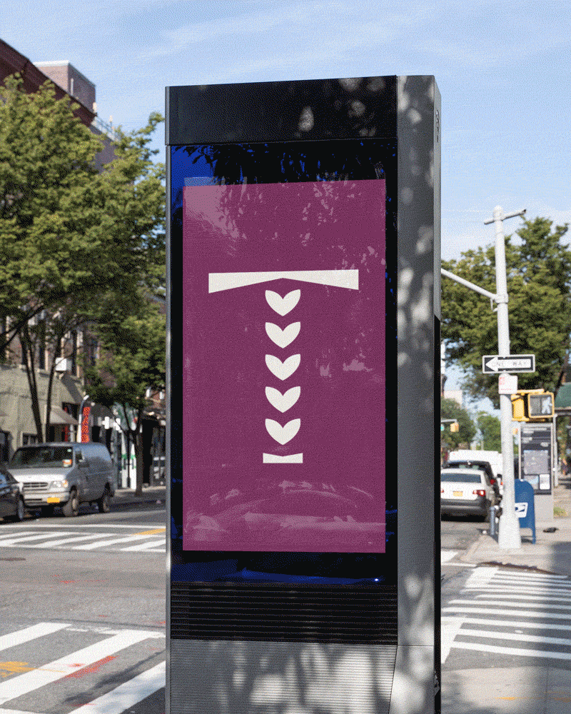
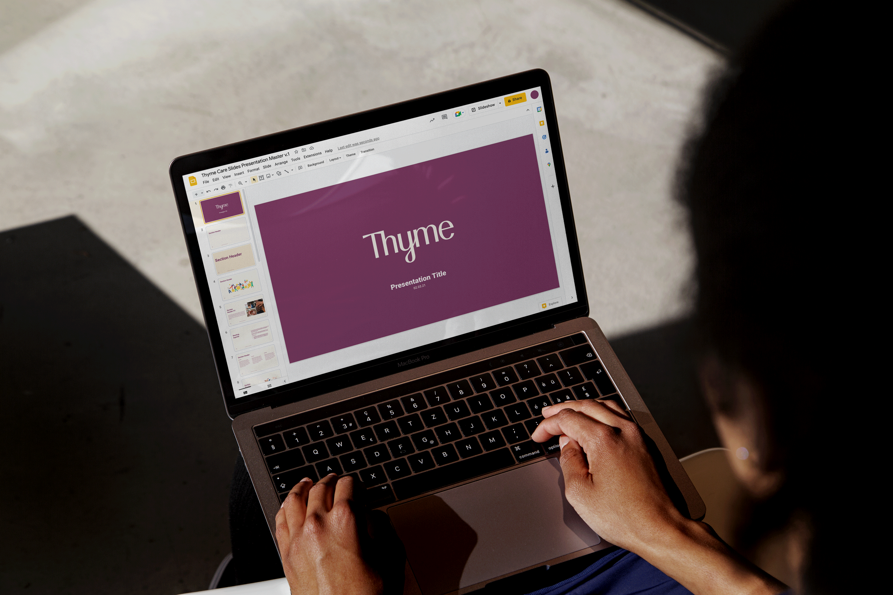
We knew we had to create a logo that felt both friendly and trustworthy and so we designed a custom wordmark that balanced authoritative with approachable. You'll see this realized in the sturdiness of the T and the more organic tail of the Y.
The brand icon is a simple reformulation of the T from the wordmark with the ascender inspired by thyme buds (that also conveniently look like hearts!)

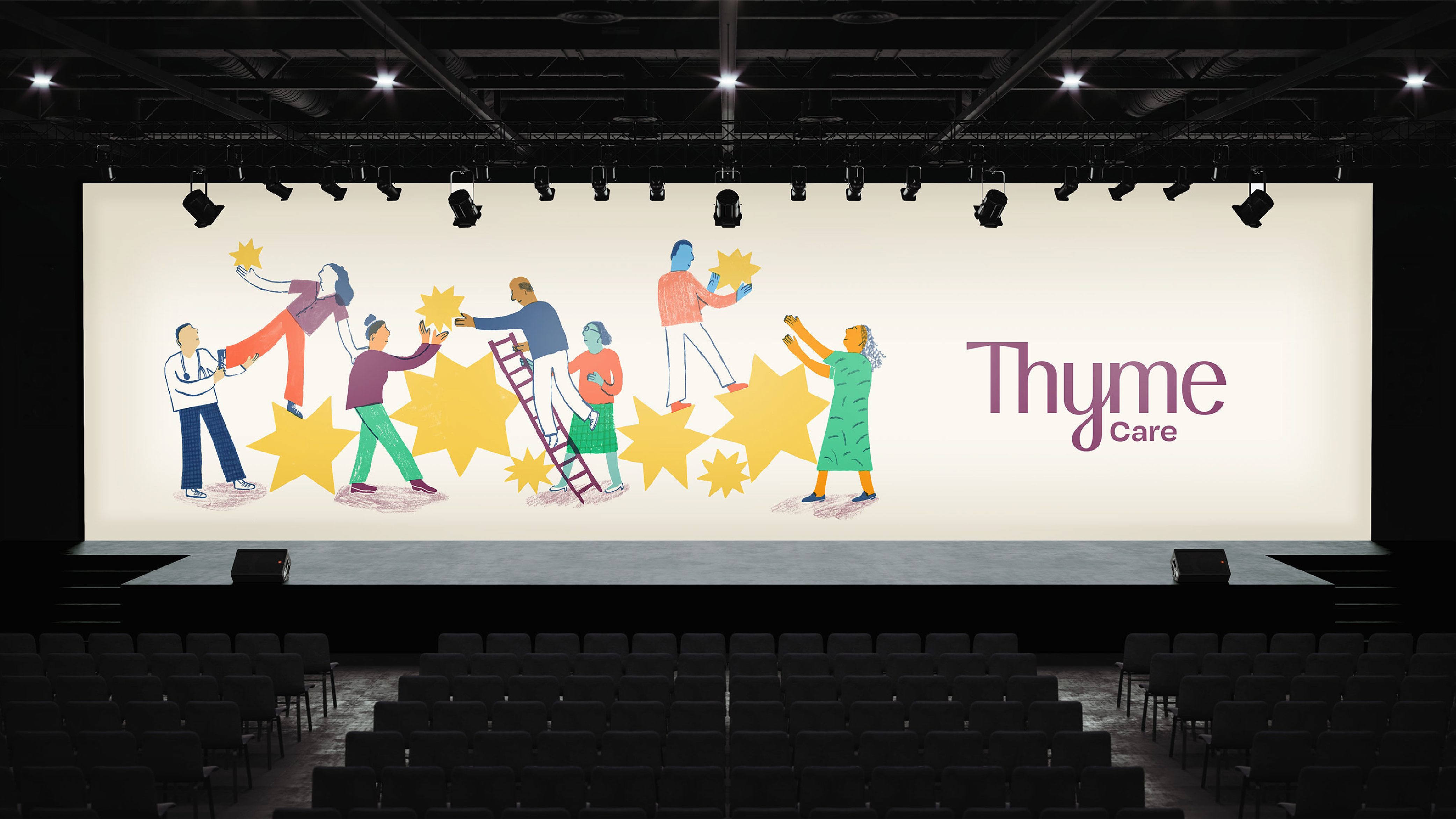
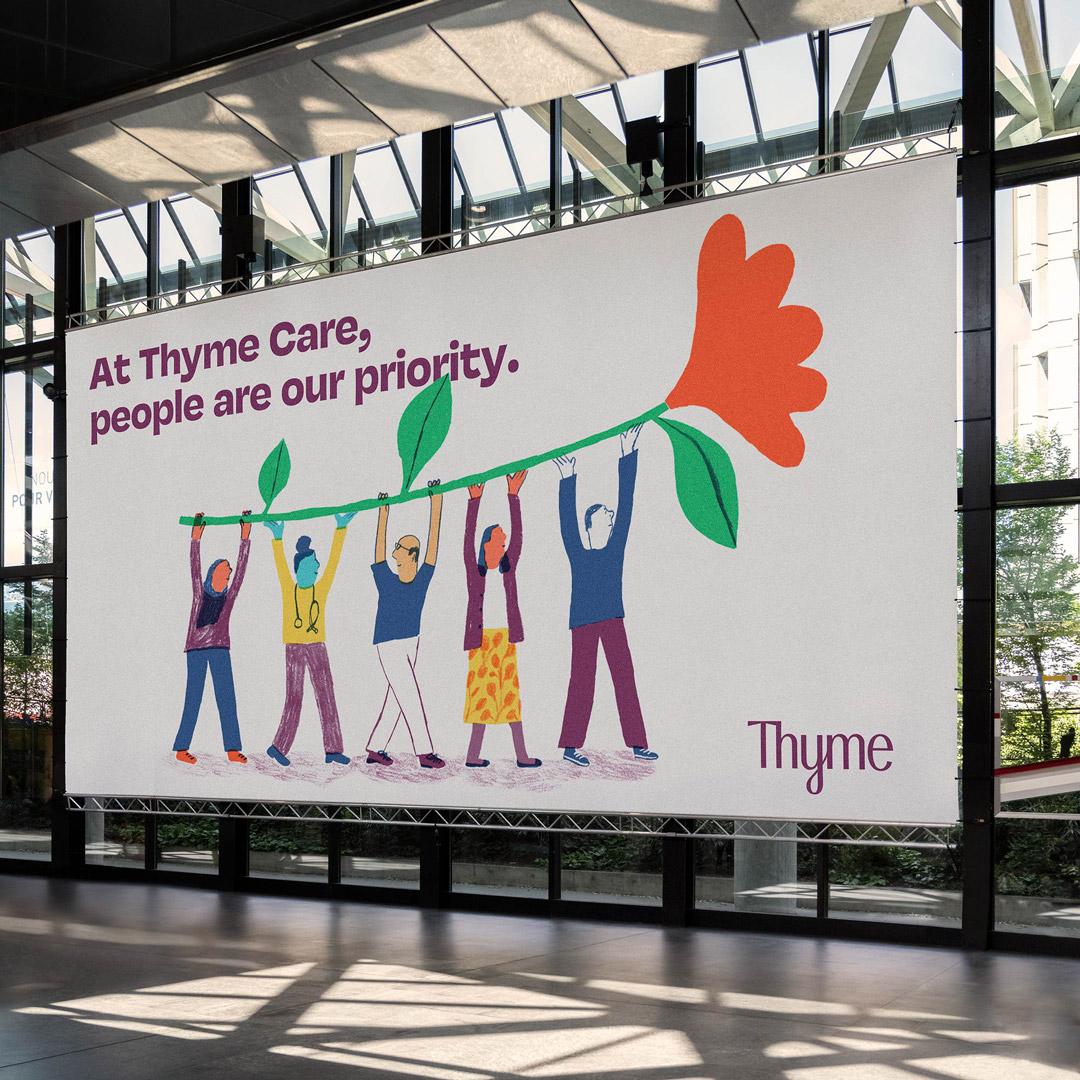
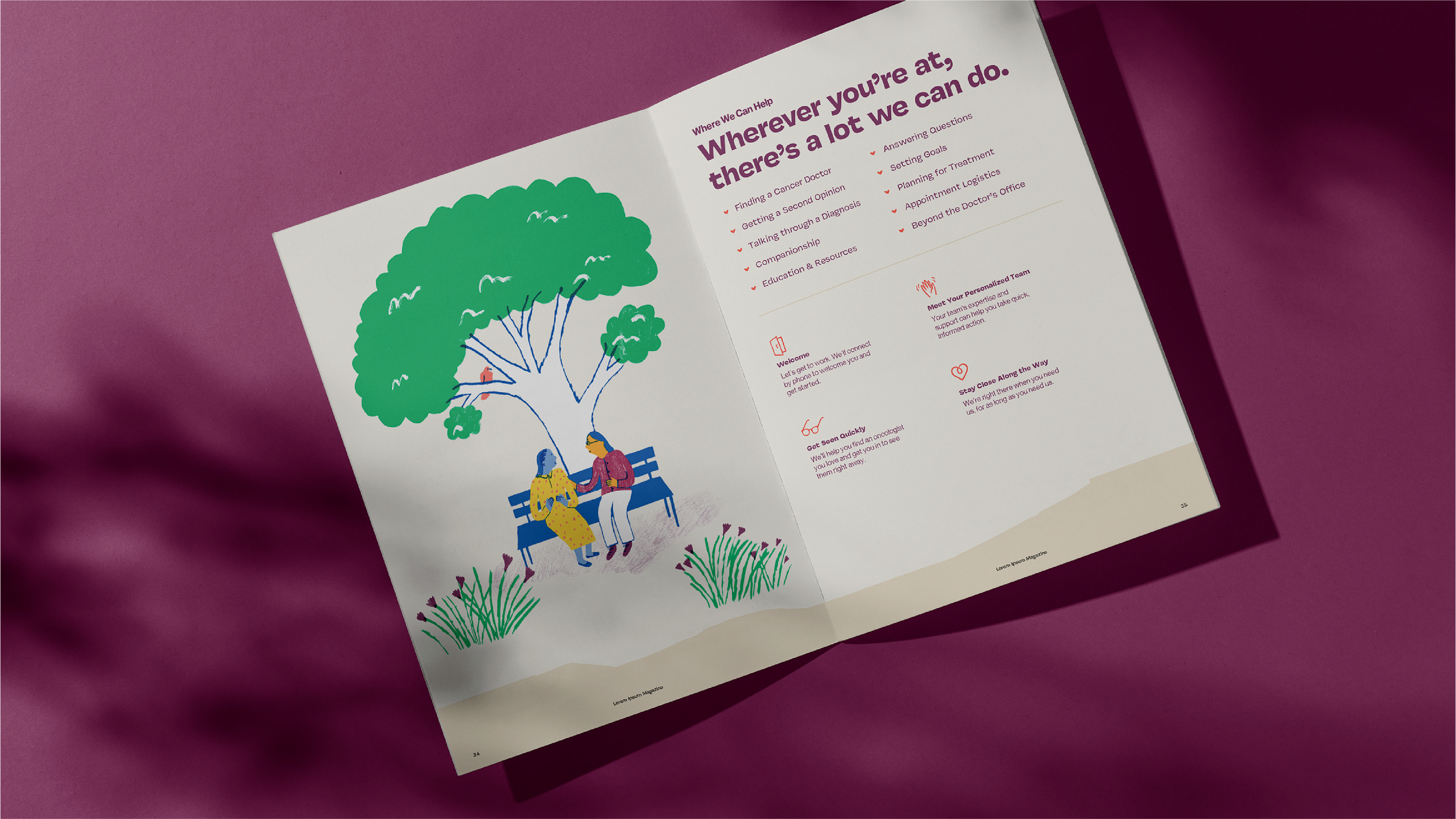
When words aren’t quite enough.
Illustration plays an important role in the brand world, where it can reach people the way words sometimes can’t. We used illustrations to communicate the wide range of emotions and experiences at some of the most challenging points in an individual's life. They allowed us to expres connectivity, support, and empowerment in a human-centric way.


Rethinking the color palette.
The rise of modern healthcare companies has seen the industry shift its color preferences away from blue (which traditionally signifies trust) to green (humanity) and, in turn, we see an oversaturation of its use. Therefore, we used color to easily differentiate the brand, drawing on the pink and purple blossoms of the Thyme plant as an immediate source of inspiration for the primary color.
A distinctive business suite
As part of the development of theidentity system, we designed a robust business suite for internal teams and external partners to easily leverage the brand in day-to-day communications.


A Website that works for everyone.
We designed a web presence with a UI & UX that's warm and easy for both patients and care providers to navigate.